
How Colored Medicine Bottles Can Help You Market Your Business
The concept of pharmaceutical businesses and dispensaries using marketing for their products seems like a bizarre idea to many people not working in those fields. But anyone in those industries can tell you that marketing plays just as important (if not even more important) a role to health-based products and pharmaceuticals.
Due to legal restrictions, a lot more thought and care often goes into marketing a healthcare brand. Color psychology is an unassuming, yet important way that pharmaceutical companies and dispensaries can reinforce aspects of their brands; even through something as subtle as colored medicine bottles.

What is Color Psychology?
If you're unfamiliar with color psychology in marketing, it's a popular method for brands to influence the behaviors and decisions of a targeted audience. Let's take McDonald's for example. The McDonald's brand of a yellow "M" towering over a red contrasting background uses a very deliberate choice of colors to reinforce feelings of fun while stoking the appetites of potential customers. Yellow is often associated with lightness and good times whereas red can mean urgency but is also used often by restaurants to stimulate feelings of hunger. Remember that old McDonald's slogan "Food, folks, and fun"? Well, the red and yellow are already promising two of those; all that's missing are the folks and that's where you come in.
If you're unfamiliar with color psychology in marketing, it's a popular method for brands to influence the behaviors and decisions of a targeted audience. Let's take McDonald's for example. The McDonald's brand of a yellow "M" towering over a red contrasting background uses a very deliberate choice of colors to reinforce feelings of fun while stoking the appetites of potential customers. Yellow is often associated with lightness and good times whereas red can mean urgency but is also used often by restaurants to stimulate feelings of hunger. Remember that old McDonald's slogan "Food, folks, and fun"? Well, the red and yellow are already promising two of those; all that's missing are the folks and that's where you come in.
Using Colored Medicine Bottles for Marketing
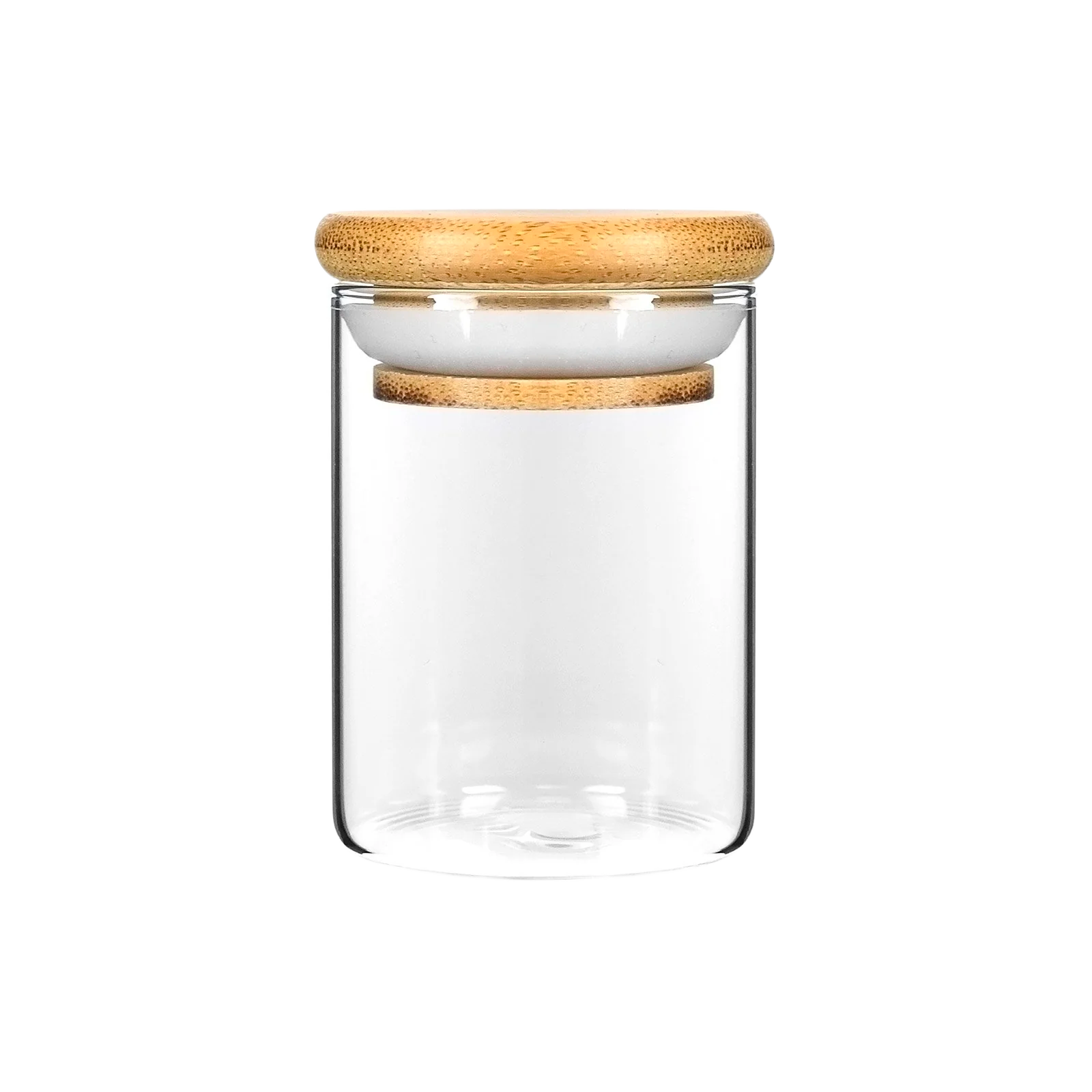
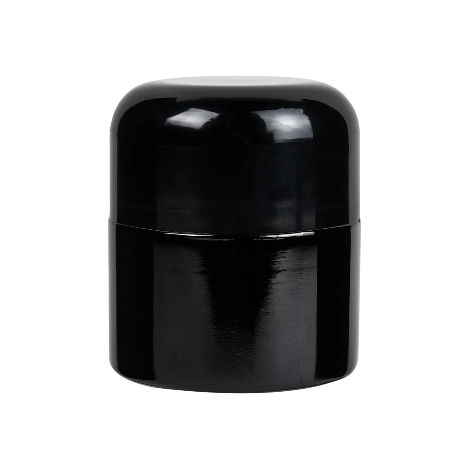
That's all fine and good for McDonald's and other restaurants but how can the same psychology be assigned to pharmacies and dispensaries? These places aren't opened to the public through altruism. They're businesses and they need branding to make sure you keep coming back to them and not their competitors. A lot of this will come down to logos and other type of marketing but color psychology can be applied right down to the medicine bottles with which their customers walk away. You can pretty much get medicine bottles in every color of the rainbow. But not each color will be equally effective in marketing your brand or product. That's why it's a good idea to familiarize yourself with the general color psychology behind each color so you can choose the medicine bottles that will best promote your intentions. Below, you'll find some color psychology basics to help you choose the right colored medicine bottles for your pharmacy's or dispensary's marketing campaigns.
 It can sometimes help to test two colors against one another too so don't worry if you feel strongly about multiple options: Black - power, luxury, seriousness Blue - trust, calm, authority Green - health, prosperity, life Orange - creativity, affordability, warmth Pink - femininity, youthful Purple - decadence, prestige, eccentricity Red - passion, urgency, intensity White - sterile, sleek, clean Yellow - youthful, fun, positive (but can appear negative depending on the shade) For anything health related, green is an obvious strong choice. For this reason, you'll often find green medicine bottles used in pharmacies and dispensaries. Other colors may work well on a less general level but more as a targeted tie-in to your company's logo colors or branding ideals. If you aren't using color psychology in your marketing, you're passing up a strategizing opportunity that can easily work in your company's favor.